As a consumer surfing the internet in search of music to stream, your first point of contact is most often the imagery of the artist. Be it still or in motion, what you see will form your first impression of the artist and will prompt you to give them a listen or not.
As such, it is imperative that artists take their imagery seriously. From pictures to contents to visualizers, there should be an intentional move to attain quality. While this writer agrees that imagery is but one aspect of the overall art, it is still worth mentioning and highlighting.
This article highlights one aspect of imagery for which some artists have still not understood its importance and relevance. This is the art of artworks.
Sample of Artworks from Ghanaian Artists

Understanding Artworks
Artworks are the still visual manifestations of a song or project that embody the mood, feel, and some extinct sonic elements of the song or project through the manipulation of colors and imagery. It also holds information on the song and/or artist, like their name, featured acts, producer, and song title.
All of this gives the consumer a pre-knowledge of what to expect from the song or project. Artworks are often used as baits to lure in listeners since, for most people, sight is the first point of contact before hearing.
How well an artwork is put together sometimes presents a first-hand marketing angle for the song/project through the conversations, excitement, and/or disappointments it generates upon its release.
Importance of Artworks
The colors, writing styles/fonts, titles, pictures, and other elements involved in the creation of an artwork all play an important role in conveying the theme, mood, emotions, message, and, to some extent, personality or brand identity of the artist.
In recent times, whenever artworks have been unveiled by artists, consumers tend to draw their own deduction from what is presented as a means to decipher what the song or project is going to center on. Interestingly, there is a social media trend where consumers have described a pose as the symbol of a great R&B album, as seen below.
Favorite Ghanaian Music Artworks
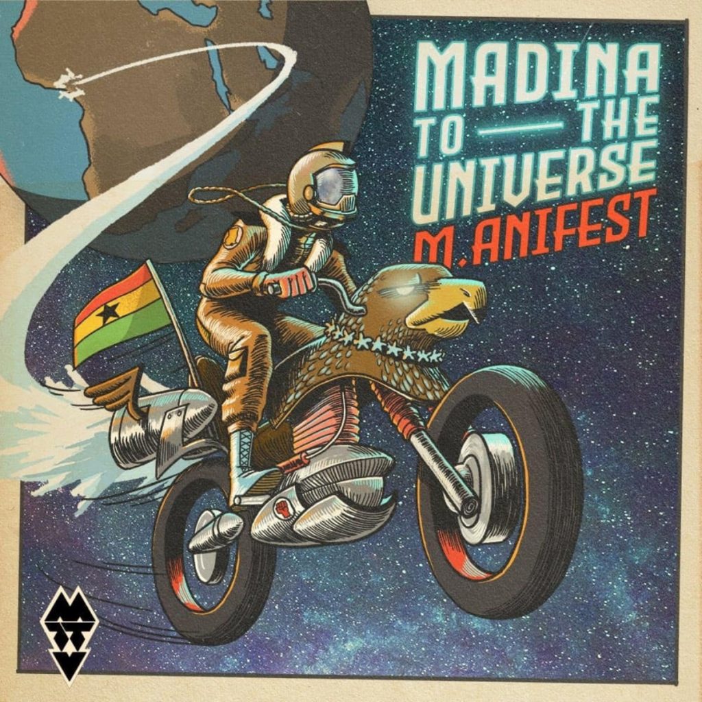
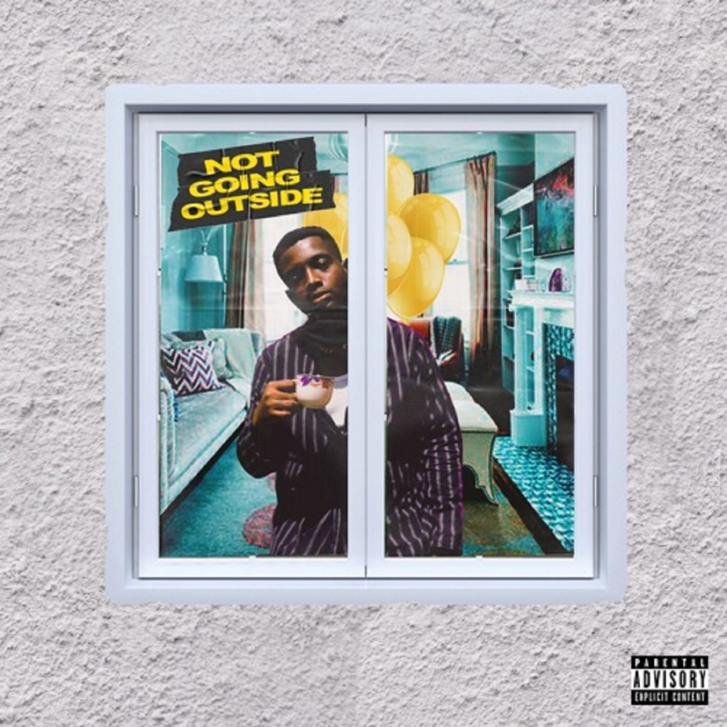
While the world celebrates some iconic artworks, Ghana has had its share of amazing artworks over the years. In a post on X, some Ghanaians shared their favorite artworks from artists like Ko-Jo Cue, Cwesi Oteng, M.anifest, Kirani Ayat, Sarkodie, Shatta Wale, Obrafour, Daddy Lumba, and a host of others.
In recent years, Shatta Wale’s artwork for his album Reign generated a lot of conversation, from the hidden messages to the likely inspirations for the artwork.
Speaking to Some Designers
To provide some clarity on what goes into creating the right artwork, we speak to some designers who share insights into what goes into creating some of the artworks we have seen around.
I do not feel I have a straightforward approach to creating my artworks. But a lot of the time it starts with a little brainstorming, a little research based on themes or art styles, or what has already been created. From there I make a mood board with random ideas I want to put together into the piece I’m creating. (Colour treatment, fonts, camera angles, art style, textures, etc.) After I just create and try to infuse each element from my moodboard.
I have met a few who see the importance of having artworks that convey the stories and brands they’re trying to tell. On the other hand, there are others who just want artworks because it’s a necessity. Usually, theirs never matches the themes/vibe of their music. I feel it affects how their music is perceived. People do judge our songs by their covers. I wish it were something everyone understood.
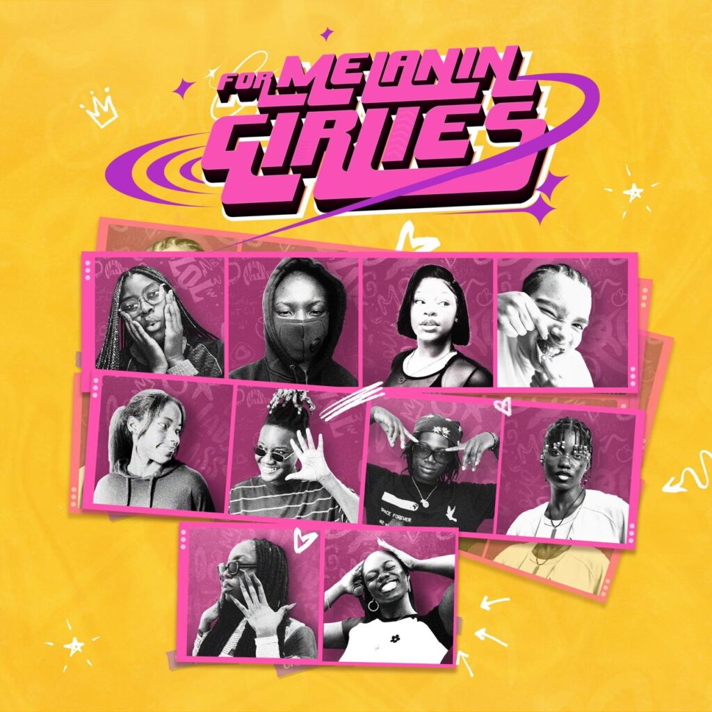
It was also fun because it was DIY. Each artist had to send different headshots—different camera qualities and lighting. I had to figure out a way to make them all cohesive in the art piece.
My routine varies from project to project. Sometimes I get to hear the song/album before I come up with ideas. I like to create artwork for how the song feels and not necessarily make a literal depiction of the project’s subject matter.
In my experience, artists don’t value the song/album artworks as much. I don’t think it’s seen as a marketing tool that separates the project from the rest and gives the artist/project its own identity. Their potential is greatly underutilized.
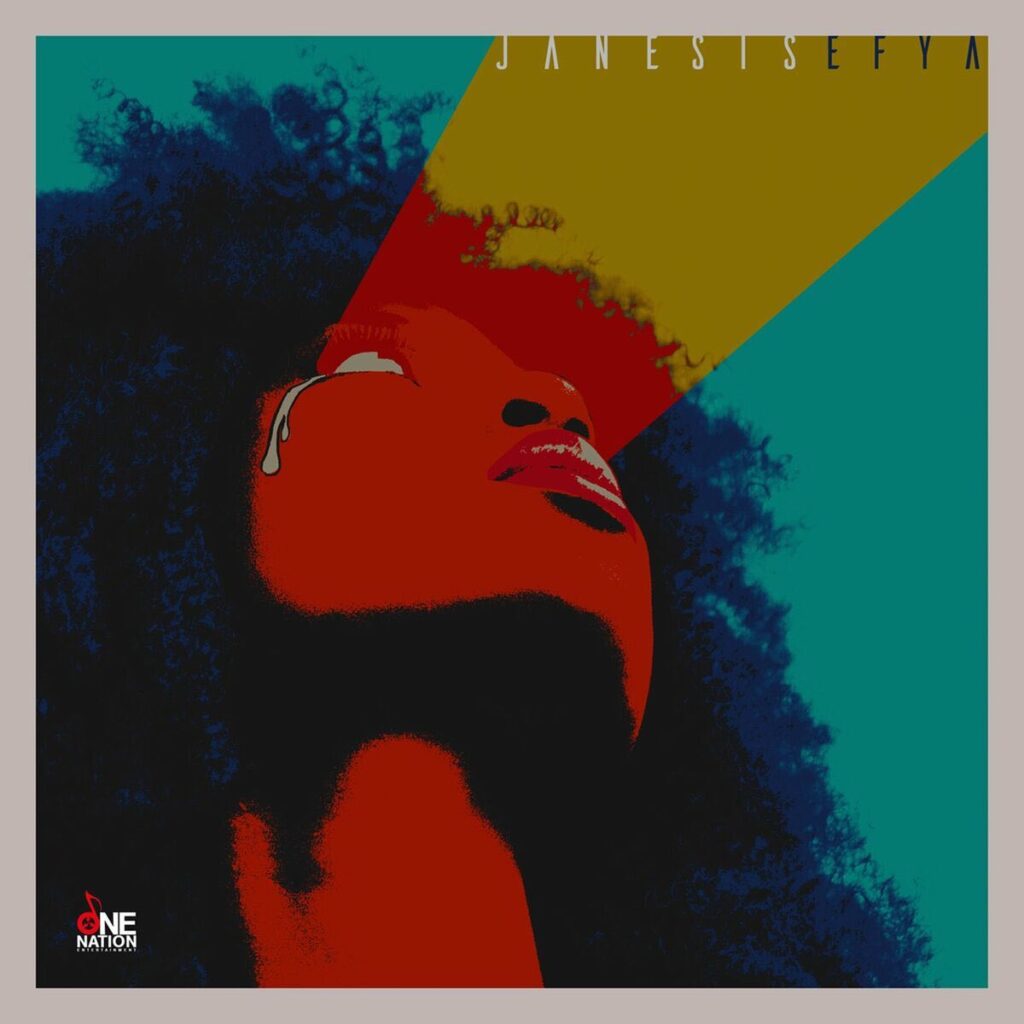
One of my favorites is Efya’s “Janesis”. I’m inspired by album artworks that came out in the 60s-70s, especially from Ghana. I wanted to make something in that vein. I wanted the teardrop to become an iconic mark that defined the album. Like the thunderbolt on David Bowie’s Aladdin Sane album cover.
I do not think I have a distinct workflow. I have always felt like the source of inspiration and ideation. My favorite thing to do is to sit with the music for some time, you know, really get to enjoying the music. Eventually, I latch onto a bar or the mood of the track for ideation and execution. In other cases, the artist comes in with a premeditated idea, and all you have to do is be the technician that realizes that vision, which for me speeds up the creation process because it minimizes revisions.
I can count on a ninja turtle hand the number of artists that really value artwork and the role it plays in marketing the music. I think it’s been a thing for a long time. How many iconic artworks can you name in the history of Ghanaian music? I’m talking mainstream.
Osibisa has some great artworks that will still hold up today. Something ELse, For My Brothers, Black Love, 21 Memory Lane, Onipa Akoma, and FOKN Wit Ewe all have great artwork to match the music. I’m sure I’m missing some, though. For most artists, the artwork is an afterthought, but the artwork alone could build so much anticipation for the music in certain cases.
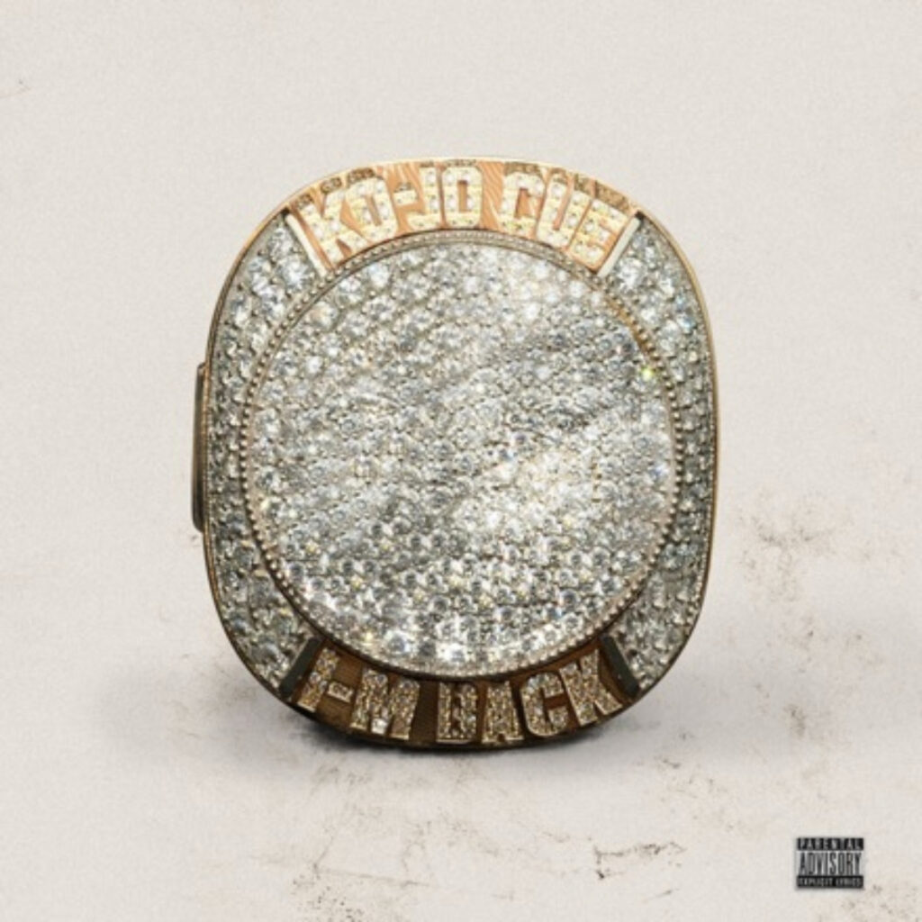
One of my favorites is Ko-Jo Cue’s I’m Back EP cover, both front and back. I think equal attention was paid to both sides of the cover. This is one of the instances where the artist was deeply invested in the outcome of not just the cover but the entire rollout. Everything else surrounding the cover was as important. The rollout drew parallels with basketball, thus the championship ring as the cover and a tracklist rendered as a playbook, featured acts announced with basketball-esque cards. It was really great watching everything unfold. The culmination of a great season in the league earns you a championship ring, which was ultimately chosen as the cover for the project.
I would have to know the brand the artist embodies, then the name of the song. When I get the name, immediately I think of a concept first in my head before I ask the artist if he has any concept ideas already. I do this because the idea the artist has might not really be in line with the song or might be way above his budget to do (the amount I charge depends on the concept). So if that’s the case, I’ll suggest mine to them, and if it’s cool, I’ll begin designing. I normally don’t use any proper moodboards; everything is in my head. I just find references in the process till the artwork is done.
Most artists do not value artworks. People reference iconic music by their cover artworks. Aside from the music being good, it’s the cover art that gives it a kind of image. You just saw the cover of your favorite song anywhere, and now you want to listen to it. People make merchandise and other forms of art from artworks and not even the music itself. But in Ghana, most artists do not value the importance of the art. They want free work; they don’t want to pay much for it. And even though there are fewer award schemes for designers and artists in the industry, there’s nothing at all to encourage people that create the body for the music to be breathed in. To me, cover artworks are the face to the soul of the music.

Currently, this is my favorite because it’s one of my recent artworks. The artist came up with the concept of the burning teddy bear to represent his ex and the fact that girls love teddy bears, so burning it symbolizes the end of the relationship and moving on. The heartbreak and dead roses also contribute to the heartbreak story of the song. It’s sweet ex for a reason, so I didn’t also draw the characters to be happy, and I also drew them in nicer clothes to show they’re at a better place and not miserable. With the background, I put them in an isolated place to show a sense of being cut off from someone who used to be a favorite person but is now a sweet ex.


